How to Calibrate a Projector for a Sharp, Accurate Picture
As an Amazon Associate I earn from qualifying purchases.
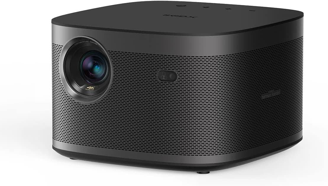
A projector fresh out of the box almost never looks its best. Factory picture modes are tuned for showroom floors, which means blown-out brightness, exaggerated color, and a bluish tint that crushes shadow detail. Calibration is the process of walking each control back to a neutral, accurate baseline so the image on your screen matches what filmmakers intended. You do not need thousands of dollars in gear to get most of the way there, but you do need patience and a dark room, because ambient light will sabotage every measurement you try to make.
Start with the physical setup before you touch a single menu. Place the projector at the throw distance recommended for your screen size, level it front to back, and use the lens shift or adjustable feet to square the image rather than relying on keystone correction. Digital keystone throws away resolution and softens the picture, so avoid it whenever you can. Once the geometry is square, dial in focus using a high-contrast test pattern with fine text or a grid. Focus on the center first, then check the corners, since some lenses trade edge sharpness for a sharp middle.
With the image placed and focused, switch the projector to its most accurate preset. This is almost always the mode labeled Cinema, Movie, or something referencing the Rec.709 color standard. These modes start much closer to correct than Vivid or Dynamic, and they save you from fighting the projector's processing later. Turn off any so-called enhancement features: dynamic contrast, edge enhancement, noise reduction, and motion smoothing all distort the source and make later adjustments unpredictable.
Now work through the basic controls in order, using free test patterns from a disc or a streaming calibration tool. Set brightness (black level) using a pluge pattern so that the darkest bars are just barely distinguishable without lifting the whole image into gray. Set contrast (white level) high enough to look punchy but not so high that bright details clip and lose texture. These two controls interact, so recheck black level after adjusting contrast. Sharpness should sit at or near zero; most projectors add artificial edges above that point.
Color temperature is where a projector often looks wrong even when everything else is right. The goal is a neutral white point around 6500K, referred to as D65. If your projector has Warm or Warm2 presets, one of them will usually be closest. For finer work, the two-point white balance controls let you adjust red, green, and blue gain and bias to flatten the grayscale so that whites and grays carry no color tint. This is the single adjustment that most improves realism, since skin tones and neutral surfaces depend on an accurate white point.
To go beyond eyeballing, a colorimeter paired with free software like HCFR or DisplayCAL lets you measure grayscale, gamma, and color points objectively. Aim for a gamma curve around 2.2 for mixed rooms or 2.4 for a fully dark theater, which controls how quickly the image moves from black to white and protects shadow detail. If your projector has a color management system, you can nudge individual colors toward their Rec.709 targets, but do this last and sparingly, because aggressive CMS tweaks often create more errors than they fix.
Finally, remember that calibration is not permanent. Lamp-based projectors shift color as the bulb ages, so recheck the grayscale every few hundred hours. Laser and LED light engines are more stable but still benefit from an annual look. Save your settings, note the lamp hours, and keep a photo of your menu values so a firmware update or accidental reset never costs you the work. A well-calibrated projector rewards the effort every single night with a picture that looks natural instead of merely bright.